SwiftUI Tips from Tutorial
SwiftUI Tips from Tutorial
https://developer.apple.com/tutorials/app-dev-training/creating-a-card-view
Shortcut to embed in Stack: right click
Padding, ForegroundColor
1
2
3
4
5
6
7
8
9
10
11
12
13
14
VStack(alignment: .leading) {
            Text(scrum.title)
                .font(.headline)
            Spacer()
            HStack {
                Label("\(scrum.attendees.count)", systemImage: "person.3")
                Spacer()
                Label("\(scrum.lengthInMinutes)", systemImage: "clock")
                    .padding(.trailing, 20)
            }
            .font(.caption)
        }
        .padding()
        .foregroundColor(scrum.theme.accentColor)
padding modifier adds padding on all corners. adding foregroundColor modifier changes all textcolors including images.
Spacer expands as much as it can following the axis.
A spacer creates an adaptive view with no content that expands as much as it can. Therefore if you want to add specific space between views, use padding
1
2
3
4
5
6
7
var body: some View {
    VStack {
        Text("Daily Scrum")
            .padding(.bottom, 10)
        Label("People", image: "person")
    }
}
Color Scheme Variant
Color for Interactive Elements
To use the same color as other interactive elements, use accentColor.
1
2
3
Label("Start Meeting", systemImage: "timer")
    .font(.headline)
    .foregroundColor(.accentColor)
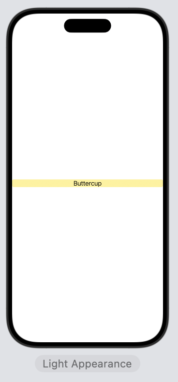
Importance of Order of Modifiders
1
2
3
4
Text(theme.name)
            .frame(maxWidth: .infinity)
            .background(theme.mainColor)
            .clipShape(RoundedRectangle(cornerRadius: 4))
1
2
3
4
Text(theme.name)
            .background(theme.mainColor)
            .frame(maxWidth: .infinity)
            .clipShape(RoundedRectangle(cornerRadius: 4))
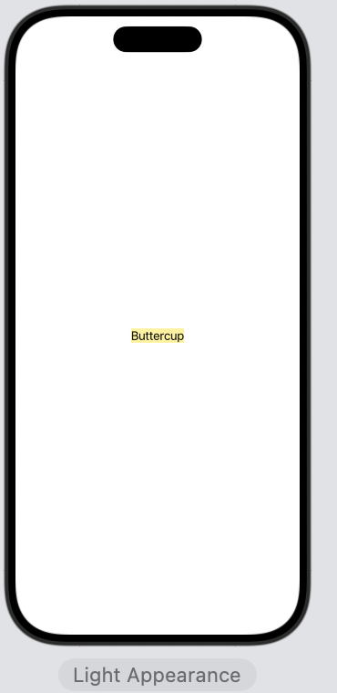
background applies to Text itself. Then frame adjusts only the frame.
This post is licensed under CC BY 4.0 by the author.